
Microsoft
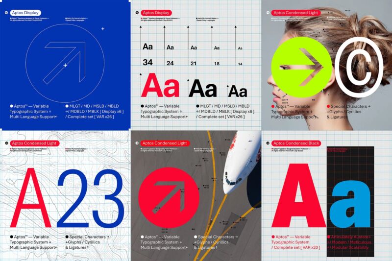
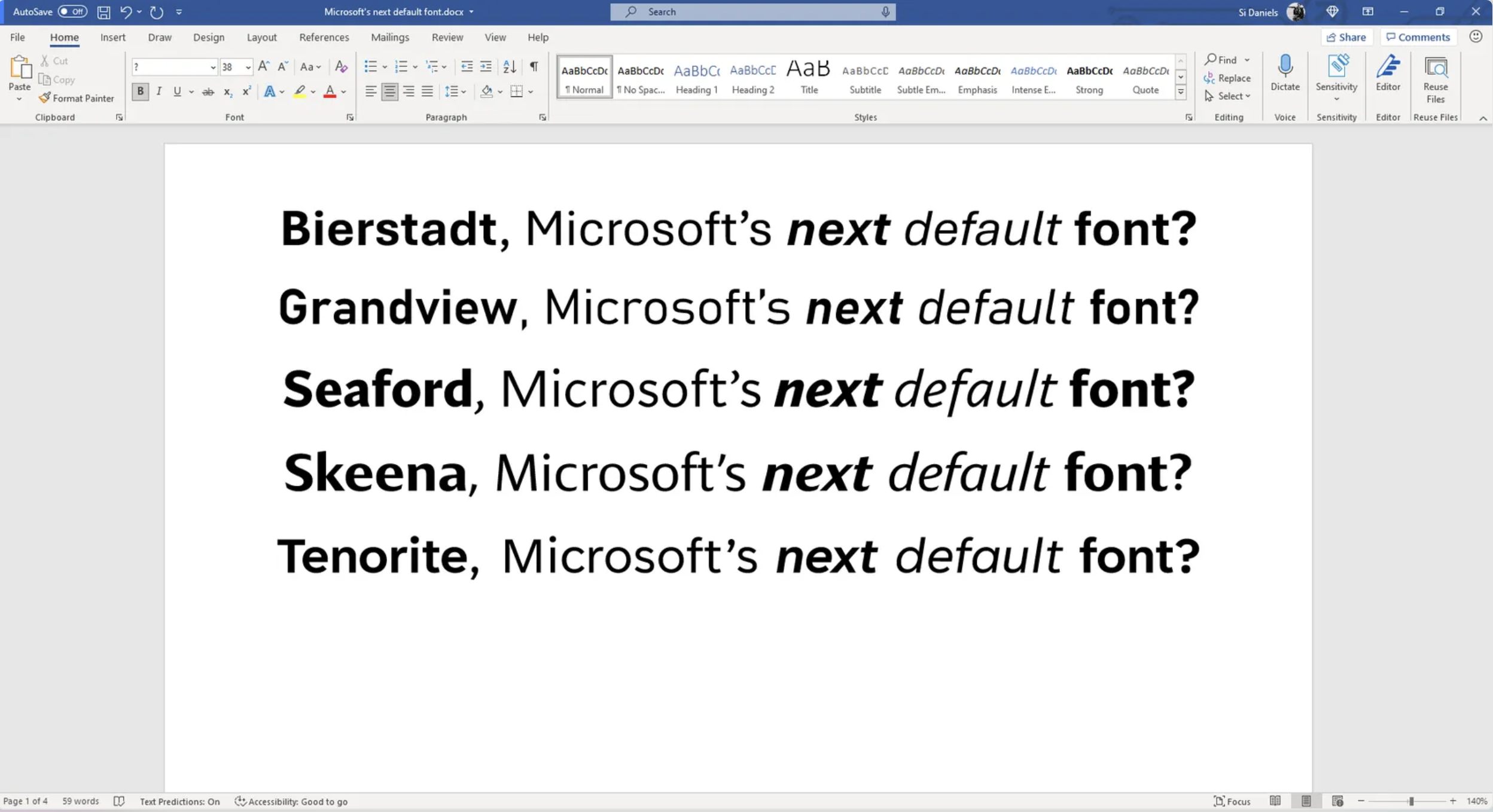
Two years ago, Microsoft announced its plans to move away from using Calibri as the default typeface for Word, Excel, Powerpoint, Outlook, and the other apps in the suite formerly known as Microsoft Office. The company introduced five candidates for replacement fonts, and a winner has emerged: a font family called Aptos, formerly known as Bierstadt.
Microsoft has never laid out in so many words why it feels it needs to move away from Calibri, though today’s announcement implies that Aptos was made with high-resolution, high-density displays in mind. Calibri replaced Times New Roman as the suite’s default font in Office 2007, at a time before “Retina” displays and when 1024×768 and 1280×800 screens were still the norm—a ClearType font, Calibri itself was a response to the shift from CRT to LCD screens.
Aptos was created by Steve Matteson, who is also responsible for Windows 3.1’s original TrueType fonts (including Times New Roman, Arial, and Courier New) as well as Segoe, which has been Windows’ default system font since Vista and is also used for Microsoft’s current logo. Given Matteson’s history with Microsoft, choosing Aptos over the others feels like the safest possible choice.
The main flavor of Aptos is a sans-serif font—described by Matteson as “Helvetica” but with “a bit of a human touch” that makes it “more approachable and less institutional.” But like Apple’s San Fransisco typeface, Aptos comes in many different styles, including condensed, monospaced, and serifed versions.
The post about Aptos’ ascension, like the original post about the five typeface candidates, is full of the highfalutin language you sometimes get when you ask design people to talk about design things. From the piece (the quote is Matteson’s):
He designed the font with a slight humanist touch. He wanted Aptos to have the universal appeal of the late NPR newscaster Carl Kasell and the astute tone of The Late Show host Stephen Colbert. “There’s always that little voice inside of me saying, ‘You know, you gotta try to sneak in a little bit of humanity. You can’t just use rulers and straight edges and French curves (a template used to help draw uniformed curves) to make all these shapes mechanical.’ I did that by adding a little swing to the R and the double stacked g,” he said. Steve wanted the font to be more universal and less mechanical or institutional. Aptos had to induce trust and be engaging to read.
Aptos is described as a font with “warmth” that is “professional and yet relatable.” Relative to Arial, it is also “more mechanical and rationalized” with “a lack of somewhat fussy curves.” Matteson says he drew the initial shapes by hand on paper rather than on a computer so that they wouldn’t become too “ephemeral.” The post also highlights that a lowercase l and an uppercase I are made to look different, something you’ll understand the importance of if you read this sentence again.
The five fonts that were vying to replace Calibri; Aptos is the font formerly known as Bierstadt.
Microsoft
The switch to Aptos begins today for Microsoft 365 subscribers; for people who bought the standalone perpetually licensed Office 2021, Calibri will presumably remain the default. Calibri will remain an option pinned to the top of the former Office apps’ font selection menu, along with Times New Roman and Arial.
As for the options that lost the default typeface contest—Tenorite, Skeena, Seaford, and Grandview—they’ll all continue to be available in Microsoft’s apps as non-default options. Everyone’s a winner.